The Tuesday Composition: Live from Iceland!

Godafoss Detail
Godafoss Detail

If you like this article, you can now get the book! Joe has expanded the “Tuesday Composition” series into an inspiring new ebook on composition, especially for nature photography. Check it out: The Tuesday Composition.

I’m about five days into a trip through parts of Iceland (yes, in January and February), and thought I would share couple of short thoughts that have come up this week as I’ve been working, along with a few unfinished images from the trip.

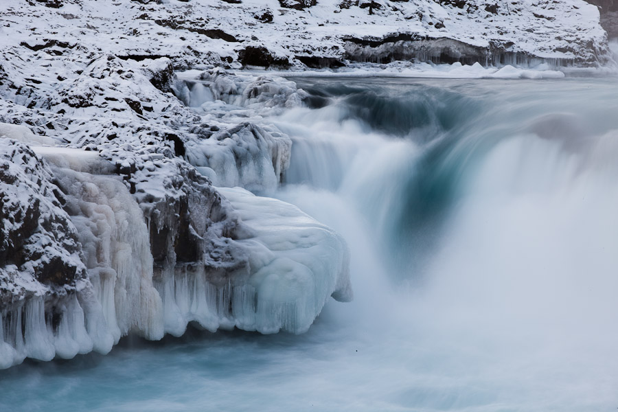
First, yes, it is in fact cold here. Most of the areas I’ve been working in are relatively coastal (save for the Myvatn area), and so temperatures aren’t quite as cold as you might think: The coldest temperatures I’ve worked in this trip have been about -13C (or 9 degrees F). I’ve worked at lower temperatures in Mono Lake. Still, it is noticeably brisk. One thing that’s been on my mind, as a result, is thinking about how to communicate the sense of that cold in an image.

In most of my images on this trip, communicating “cold” has come down to one of two ideas (or both)–color, and the presence of ice or snow.
(more…)

Continue Reading

The Tuesday Composition: Live and In Color

Early light, Bodie
Early Light, Bodie. Purple and yellow form an effective color contrast here, incresing our sense of saturation in both colors. (Having them set against black also helps pump up the apparent saturation.)

If you like this article, you can now get the book! Joe has expanded the “Tuesday Composition” series into an inspiring new ebook on composition, especially for nature photography. Check it out: The Tuesday Composition.

Even though we’re twenty or so columns into this series, nearly everything I’ve said so far about composition applies equally to monochromatic and color images. Today I’m going to focus a on how color and color combinations play into compositions. We’ll revisit a few old topics, such as contrast, edges and balance, and we’ll talk about how color figures into them. I’ll also talk a little bit about color theory, without giving a full introduction to it.

Contrast is the first subject I’ll revisit. Just as tonal contrast can be created with lots of sharp transitions from dark to light, color contrast can be created with lots of sharp transitions from a color to the complement (opposite) of that color. I was taught color complements in grade school by looking at a color wheel: Yellow is opposite purple; red is opposite green; blue is opposite orange. But don’t think you need to use those precise combinations to get great color contrast, nearly-complementary color combinations, such as yellow and blue, often create very effective color contrasts as well (as in Aspens, Walker Creek, below). (more…)

Continue Reading

Color balance

or, learning to see like your camera, part 2

Let’s start by saying that color is a science. It’s a big science. It’s so big that there are entire institutes full of people so smart it makes my head hurt, all studying color. So I think it’s safe to say we’ll not be comprehensive here. We will cover the basics of color balance and differential color temperatures, as they pertain to shooting. Color management on the back end, calibrations, color profiles are for another time.

(more…)

Continue Reading
Close Menu