Mist and Snow, Cummings Creek Wilderness. One of the multiple flaws in this image is the convergence of the tree trunks; they're slightly closer together at top than bottom. This could be easily corrected in Photoshop, not so easily in Lightroom alone.
One of the most common questions I get when teaching my Adobe Lightroom workshops, is whether Lightroom is enough. The answer to that question depends on your needs and goals. But it is worth spending a bit of time reviewing reasons a photographer who has Lightroom 2 might also want to invest in Photoshop:
Graphic Design: If you are authoring your own web site or other publications, you may want Photoshop (or other tools) for laying out text over images, and so on.
Healing Tool Differences: There are some really nice things Lightroom can do that Photoshop can’t (like synchronizing correction spots on identical compositions), but Lightroom’s spot removal tool works best on small spots. Photoshop’s healing brush seems a more powerful option for larger scale healing, such as removing linear defects like branches or cracks in scanned images. (more…)
Redwoods and Rhododendrons. Default sharpening settings.
A couple days back Tronam made a perceptive comment on my JPEG export saturation loss post, noting that he’d noticed saturation loss being caused by sharpening, but wasn’t quite sure why that was happening. I immediately smacked my forehead, because I’d known about the ways sharpening could sap saturation, but hadn’t thought about it when writing that previous article. So, today, we’ll dive into it.
There are three key points. First, sharpening can (but won’t always) have an effect on saturation. Second, that loss isn’t always avoidable. Finally, if you’re working with images in Lightroom, it’s possible (although unlikely) that you won’t notice that saturation loss until you actually export the image. (more…)
One of the best stock agencies I deal with, the UK outfit Alamy, is well-known for their meticulous standards, and I totally respect that meticulousness. Still, there is one particular part of the Alamy submission process that’s error-prone and resistant to automation, and that is the seemingly trivial matter of image sizing. Due to the amount of misinformation out there on the subject, I thought I’d take a crack on explaining what it is they want, and how you can reliably make sure you meet those specs. (more…)
Virga over the Straits of Magellan. The sky was more interesting than the water, so I used a lot more sky than water. Sometimes it's that simple.
If you like this article, you can now get the book! Joe has expanded the “Tuesday Composition” series into an inspiring new ebook on composition, especially for nature photography. Check it out: The Tuesday Composition.
Last week we talked about working the edges of your photographs. This week, I thought we’d start taking about where we place objects in an image; I like Geir Jordahl’s metaphor of choreography. By moving around, by pointing the camera in different directions, by choosing a framing and focal length and orientation of our shot, we’re including and excluding objects from our image, changing their size and shape and moving them around within our image. While we do not have (outside of Photoshop) unlimited flexibility to rearrange our images this way, we do have quite a number of controls over where we place in our images. So, where should we put them? Where will they look best? (more…)
Autoloader for Photoshop has completely changed my workflow and saves me hours of time every session I edit. This video will teach you how I use this Photoshop script…
Many times I’ve heard the understandable complaint that, after a good bit of working an image to get just the right color, that those colors are sapped by Photoshop or Lightroom when the image is exported to JPEG and then viewed on the web. There are all sorts of explanations on the web about this, and a lot of posturing about the “right way to handle things,” and there are all sorts of issues with the wealth of uncalibrated monitors out there, web browsers that don’t support color management at all (IE, Chrome, older Firefox) vs. those that do support it (Safari, more recent Firefox).
My clients come from the full spectrum of business types – everything from one and two person start ups to multi-national corporations. Each of these clients, of course, have unique needs and expectations, but I’ve come across one area that more and more clients are in need of. Digital Asset Management (DAM.) Most of the larger corporations have a system in place already, after all they’ve been dealing with this issue for time immemorial, and if there is anything large groups like to do, it’s set procedures and systems. However, many smaller clients are just beginning to realize that they need to keep better track of their images. And, if you’re working with startups, chances are they have no idea that this will become an issue for them later on. This is an opportunity for you to educate them and set them on a good path now. (more…)
Morning by the Merced. Notice how your eye is more attracted to the tree leaves than the canyon walls.
If you like this article, you can now get the book! Joe has expanded the “Tuesday Composition” series into an inspiring new ebook on composition, especially for nature photography. Check it out: The Tuesday Composition.
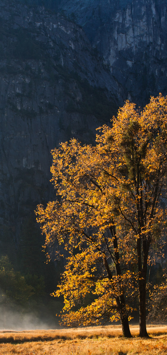
In a previous column we’ve talked about how the eye is attracted to and tends to follow along edges in a scene, and that similarly, the eye tends not to spend much time wandering in the center of silhouetted areas, tending to explore the edges of those areas instead. Both of these ideas are related to the fact that as one looks at an image over time, the eye will spend more time looking at areas of high contrast than areas of lower contrast. If your image is half-solid without texture, and half a simple textured pattern, the viewers’ eyes will tend (depending, of course, on the dozens of other factors that go into human perception) to spend more time wandering around the patterns.
This autumn image from Yosemite Valley demonstrates the principle. As we look at the image over time, our eye spends a lot of time wandering around the tree branches and leaves compared to the shadowed valley walls or the thin strip of foreground grasses. If we were just trying to understand why our eye spends more time on the tree than the valley wall we might think it was just a matter of the tree leaves being highlights that our eyes are attracted to. But here, while our eyes might very well be first attracted to the brightest part of the image (the grasses at the base of the image), the the eye will eventually spend more time wandering the more interesting and complex patterns of the branches. And the large contrast in the tree leaves (both color contrast and tonal contrast) is a primary reason why. (more…)
Whirlwind Rainbow. Seljalandfoss, Iceland. Selecting the right keywords for this image will be critical to helping me sell this image as stock. Image Copyright 2009 Joe Decker
In the process of keeping my eyes open for new resources, I recently purchased and watched “Where the #%*! are My Pictures?”, a three-hour video series by Michael Reichmann and Seth Resnick which focuses on the the file-handling, digital asset management (roughly speaking, the Library module) aspects of Lightroom. I’ll be adding this to my list of top recommendations for Lightroom resources, I think it’s particularly appropriate for folks who have a basic familiarity with Lightroom but are ready to take their understanding up a notch and really make their workflow sing.
The question “Where are my images?” creeps up on most photographers as they continue to work over years. Three years ago I was convinced that that this “digital asset management” thing was quite possibly overkill for me. After all, I knew most of my images and I had everything organized in directories by year and location. How hard could it be for me to find an image someone might want of Death Valley? My first lesson came when I got a request to see all my flower macro work. I spent hours putting together that request. “Where the #%*!…” reinforces that lesson while at the same time showing that the cure for that disease is a lot less imposing than it might seem at first. Good habits and good presets go a long way toward making Lightroom file management easier, and this series does a great job of helping photographers along that path. (more…)
This video will teach you how create and apply a watermark for your photos in Photoshop. You will learn how to apply your logo to your photos wherever you desire.…