The Tuesday Composition: The Attraction of Opposites

If you like this article, you can now get the book! Joe has expanded the “Tuesday Composition” series into an inspiring new ebook on composition, especially for nature photography. Check it out: The Tuesday Composition.
Opposites attract ... our attention.
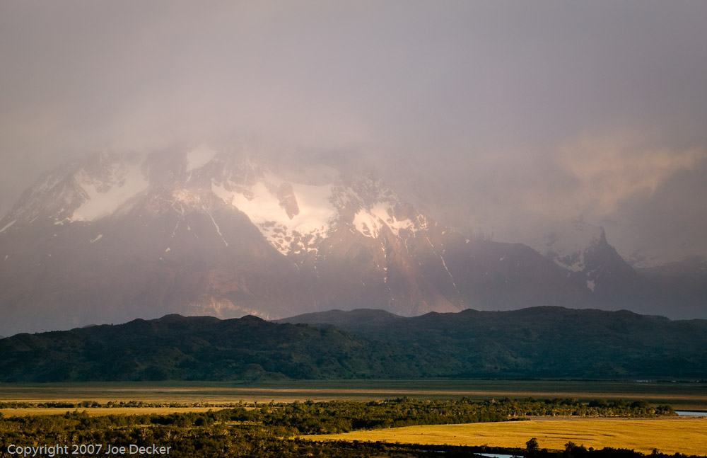
Opposition is one of the primary themes in photographic composition, one which was first emphasized to me by Frans Lanting, the powerfully talented photographic storyteller. At the simplest level, putting together two areas of different tone (brightness) forms a contrast which pulls our eyes toward the boundary between them. Contrasting opposing colors has a similar effect, attracting our attention and actually enhancing the saturation and power of the individual colors.
But using contrast and opposition in composition goes far beyond that, contrasting concepts can be a very powerful tool for composing a photography to communicate a particular message. Contrasting concepts, much as with contrasting colors, has two effects.
First, the viewer’s attention is drawn to the nature of the contrast. The black and white of a yin-yang symbol draws our attention to tones, the difference between light and dark. Similarly, a photograph of an infant and an adult leads the viewer to think about age, and as a result, perhaps issues of family relationships and parenting. It’s almost impossible to view Guanaco Anticipating the Future without thinking about the relationship between the two animals (we assume that one is the parent of the other), a concept that wouldn’t come to mind nearly as quickly if I’d only included one animal (or two of the same age and size).
Second, contrasting two things seems to often exaggerate each of them. If we put a smooth texture next to a rough texture, both the smoothness and the roughness are stronger, more apparent. If we put a moving object (perhaps communicated with motion blur) in an unmoving scene the sense of motion may be enhanced. (more…)