If you like this article, you can now get the book! Joe has expanded the “Tuesday Composition” series into an inspiring new ebook on composition, especially for nature photography. Check it out: The Tuesday Composition.
Even though we’re twenty or so columns into this series, nearly everything I’ve said so far about composition applies equally to monochromatic and color images. Today I’m going to focus a on how color and color combinations play into compositions. We’ll revisit a few old topics, such as contrast, edges and balance, and we’ll talk about how color figures into them. I’ll also talk a little bit about color theory, without giving a full introduction to it.
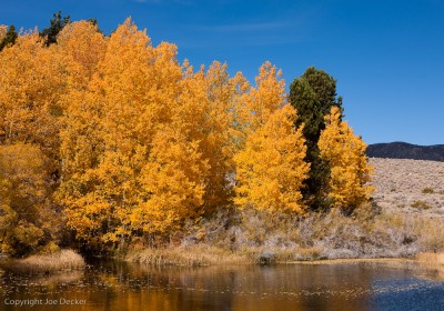
Contrast is the first subject I’ll revisit. Just as tonal contrast can be created with lots of sharp transitions from dark to light, color contrast can be created with lots of sharp transitions from a color to the complement (opposite) of that color. I was taught color complements in grade school by looking at a color wheel: Yellow is opposite purple; red is opposite green; blue is opposite orange. But don’t think you need to use those precise combinations to get great color contrast, nearly-complementary color combinations, such as yellow and blue, often create very effective color contrasts as well (as in Aspens, Walker Creek, below).
Areas with strong color contrast, like a red leaf on a green lawn, attract our eyes much in the same way that areas of high tonal contrast do. Putting those contrasts next to one another also tends to increase how saturated the colors appear, orange leaves against a blue background look more saturated than the same leaves on a (say) yellow background. (Contrasting colors with black will also make them appear more saturated as well.) Colors close to one another on the color wheel create less of this color contrast, and much like areas with low tonal contrast, groups of very related colors can be quite beautiful, but will tend to be more peaceful than an otherwise similar group of unrelated colors.

You might think that color contrasts would translate into colors that can form effective edges; but the effectiveness of edges between different colors seems to be more a function of tonal contrast than color contrast. Even when you have a good color contrast in a scene (green and red, say) poor tonal contrast can leave the edges between the two less powerful. On the other hand, edges with good color and tonal contrast may be even more effective (a light orange against a dark blue).
Finally, our eyes tend to be attracted (all other things being equal) to saturated colors, much the way our eyes are attracted to highlights. You’ve likely come across the idea of accent color, where in selecting the colors for a photograph (or the interior of a building, or whatever) you work with a palette of mostly less-saturated colors, and put in a few items of some brighter color, which are called accents.
Our eyes are attracted to those accents. Because our eye can quickly “lock in” on those accents, we quickly notice if the things our eyes are attracted to are the same color. If they are, the repetition of those elements ties those accents together and makes the whole scene seem simpler, makes the whole image fit together better.
There’s a reason I’ve left color (mostly) out of the Tuesday Composition discussions until now, I subscribe to Richard Knepp’s observation that most really great color images would make effective black and white images as well. While you can go a long way in composition just looking at placement and tone, color has an important role to play as well.