The Tuesday Composition: Just Move!

If you like this article, you can now get the book! Joe has expanded the “Tuesday Composition” series into an inspiring new ebook on composition, especially for nature photography. Check it out: The Tuesday Composition.

Keep moving!

Skägafoss Detail
Skägafoss Detail

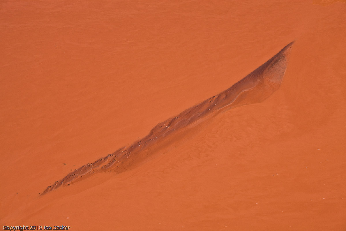
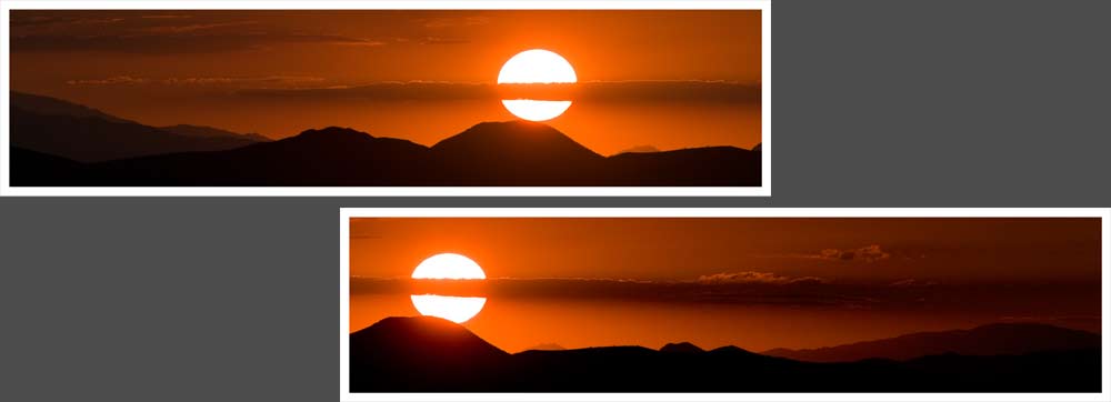
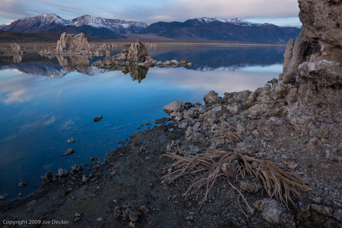
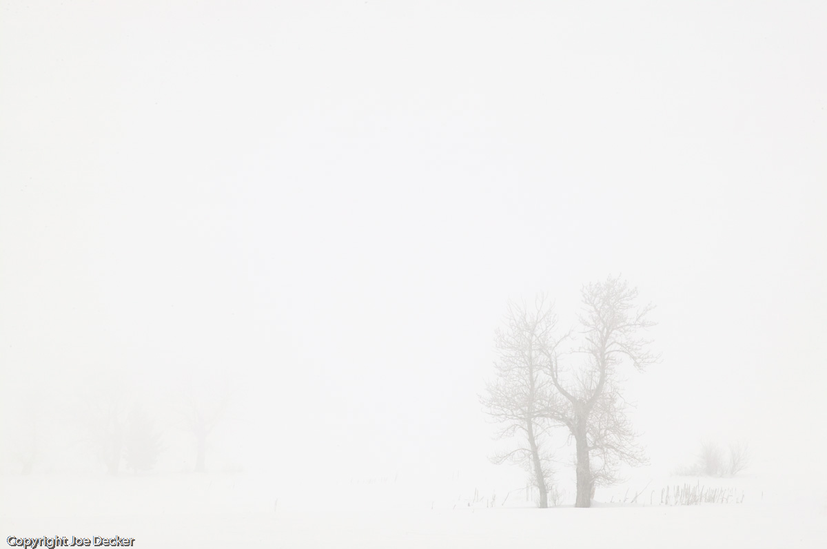
One of the best things about giving “shoot and critique” workshops is that I get the opportunity to see what participants can make out of a given situation. It’s great to see how different and interesting their visions are-I constantly learn things from my students by observing their photographic vision. But it’s also a great environment for me to be able to give knowledgeable feedback. Over the years, one of the most common themes I’ve seen in my feedback, particularly to beginning photographers, is suggesting that the image might have improved if the photographer had moved a little-whether left, right, forward, back, up or down.

Every movement of the camera and photographer changes the “choreography” of the images, some subjects get bigger, some smaller, and the position of the elements involved changes as well. Perhaps some appear – or disappear – around other objects. The positioning of the objects in the frame changes as well, movement is a powerful photographic tool. (more…)

Continue Reading

The Tuesday Composition: Not so much rules…

And thirdly, the code is more what you’d call “guidelines” than actual rules
–Barbossa, Pirates of the Caribbean: Curse of the Black Pearl

If you like this article, you can now get the book! Joe has expanded the “Tuesday Composition” series into an inspiring new ebook on composition, especially for nature photography. Check it out: The Tuesday Composition.

Today I’m going to take a brief digression from specific compositional topics, back up, and talk about compositional “rules”.  I’ve said this before, but it’s worth repeating.

They’re not rules.

Lithodendron Wash Abstract
Lithodendron Wash Abstract. I didn't shoot this based on "rules", I shot it based on intuition. (Image created as part of the National Park Service Artist-in-Residence Program at Petrified Forest NP.)

By this point in the Tuesday Composition series I’ve written about almost thirty ideas, each of which could be thought of as one (or perhaps a couple of) rules. But using them as rules will, in the end, limit your creative reach as a photographer. I urge you, in fact, I beg you not to use them as rules, either when you create your own images or, just as importantly, you look at an image of another photographer.

Let’s talk about that. It’s easier to begin this discussion by thinking not only about our own work but someone else’s. When I see a new image from a book, an advertisement, whatever, the first thing I do is to look at it, to see it. I do not drag out my list of rules and walk through it adding up a score. Instead, I look, and feel what I feel, notice what I feel. I don’t start with an analytical process, I start with an intuitive, visual process. (more…)

Continue Reading

The Tuesday Composition: Diptychs and More

Chiricahua Sunset.  The combination of the positioning of the pieces and the positioning of the views (see text) combines to create a sense of movement.
Chiricahua Sunset. The combination of the positioning of the pieces and the positioning of the views (see text) combines to create a sense of movement.

If you like this article, you can now get the book! Joe has expanded the “Tuesday Composition” series into an inspiring new ebook on composition, especially for nature photography. Check it out: The Tuesday Composition.

So far in this series we’ve discussed images “in the box” of a single rectangular frame. Today, I’ll talk a little about ways to “think outside the box” and use multiple images together as part of a single artwork.

First, a few words of terminology. Diptychs were traditionally any sort of artwork or other object with two plates connected together with a hinge. These days the hinge is optional, and the term is applied to any sort of art in which two pieces are meant to be hung together (usually in a particular arrangement). Triptych refers to the same idea with three images. Polyptych is the general term for two or more pieces. Multiples is sometimes used similarly to polyptych (although the former might be two images printed separately on the same piece of paper). I’m going to stick with “multiples” here as the most inclusive term.

In nearly every multiple, we’re encouraged to consider the relationship between the individual parts of the artwork. The relative placement of the different parts within the artwork is one part of this; if the two halves of a diptych are laid out left to right, we’ll be far more likely to “read” the left image first and the right image second. To the extent that the images combine to tell a story, the left segment of the image will usually tell an earlier part of the story, the right segment the latter part. Not every multiple tells a story (Andy Warhol’s famous silk-screened multiples of Marilyn Monroe don’t seem to really imply a sequence in time), but many do. (more…)

Continue Reading

The Tuesday Composition: The Attraction of Opposites

The contrast between the size and age of the guanaco calls our attention to not only to the difference, but to the relationship between the two.
Guanaco Anticipating the Future. The contrast between the size and age of the guanaco calls our attention not only to the difference, but also to the relationship between the two.

If you like this article, you can now get the book! Joe has expanded the “Tuesday Composition” series into an inspiring new ebook on composition, especially for nature photography. Check it out: The Tuesday Composition.

Opposites attract ... our attention.

Opposition is one of the primary themes in photographic composition, one which was first emphasized to me by Frans Lanting, the powerfully talented photographic storyteller. At the simplest level, putting together two areas of different tone (brightness) forms a contrast which pulls our eyes toward the boundary between them. Contrasting opposing colors has a similar effect, attracting our attention and actually enhancing the saturation and power of the individual colors.

But using contrast and opposition in composition goes far beyond that, contrasting concepts can be a very powerful tool for composing a photography to communicate a particular message. Contrasting concepts, much as with contrasting colors, has two effects.

First, the viewer’s attention is drawn to the nature of the contrast. The black and white of a yin-yang symbol draws our attention to tones, the difference between light and dark.  Similarly, a photograph of an infant and an adult leads the viewer to think about age, and as a result, perhaps issues of family relationships and parenting. It’s almost impossible to view Guanaco Anticipating the Future without thinking about the relationship between the two animals (we assume that one is the parent of the other), a concept that wouldn’t come to mind nearly as quickly if I’d only included one animal (or two of the same age and size).

Pink Morning Mists
Pink Morning Mists, Torres del Paine.

Second, contrasting two things seems to often exaggerate each of them. If we put a smooth texture next to a rough texture, both the smoothness and the roughness are stronger, more apparent. If we put a moving object (perhaps communicated with motion blur) in an unmoving scene the sense of motion may be enhanced. (more…)

Continue Reading

The Tuesday Composition: Composing Images with Water

Surf, Garrapata Beach
Surf, Garrapata Beach. Still images can't capture motion in water, but they can communicate the idea.

If you like this article, you can now get the book! Joe has expanded the “Tuesday Composition” series into an inspiring new ebook on composition, especially for nature photography. Check it out: The Tuesday Composition.

Like mist and fog, water is a subject that deserves it’s own consideration compositionally. With the exception of very still lakes and ponds, one of the things that makes water “look like water” to us is the way that it moves. We can’t present this movement in a still image to a viewer directly. Instead, we have to translate it into a still image by making an exposure; and we use a variety of controls such as shutter speed and composition to help communicate a sense of that motion.

When we want to capture a sense of movement in water there are several things to keep in mind. Shutter speed has a significant effect-a waterfall, cascade or even surf against a coastline will have a very soft, gentle feel if we use a long exposure. Faster exposures will stop individual droplets in air, creating a greater sense of energy.  Shutter speed isn’t the only thing to keep an eye on, though. The way we compose the path of water through a scene can also affect how viewers experience water moving through a scene. Where possible, try and make it easy for the viewer’s eye to trace along the lines of the water’s path. Your images will (all other things being equal) be more effective if the visual flow of the water isn’t interrupted by things that block the view of the water. Diagonals and  S-curves can also create an additional sense of motion. (more…)

Continue Reading

The Tuesday Composition: Framed, Inside and Out

North Falls Canyon, Silver Falls State Park, Oregon

If you like this article, you can now get the book! Joe has expanded the “Tuesday Composition” series into an inspiring new ebook on composition, especially for nature photography. Check it out: The Tuesday Composition.

Many of the topics we’ve discussed so far talk about the relationship between two objects in an image, from their relative distance from the camera to whether one is left or right of the other to visual similarity between two objects. Many of the cues we use to communicate using photographs stem from these sorts of signs. Today I’ll talk about another example: what happens when one image frames another within a photograph. I’ll say that the enclosing object “frames” the enclosed object, but here I’m not referring to picture frames, I’m still talking about parts of the photographic image itself.

These frames tend to serve two ends. Visually, frames in general (and darker frames in particular) often guide the eye toward the center of an image much in the same way that edge-burning does. As a matter of meaning,   framing often provides context for the enclosed subject of the image. I think it’s likely that these two effects are related; our eyes are pulled to the center,   the enclosed object in such a photograph, and as a result that object becomes the primary subject of the image. The frame itself speaks second, not first. (more…)

Continue Reading

The Tuesday Composition: Both Near and Far

Bleached bush skeleton, Mono Lake, California
Bleached bush skeleton, Mono Lake, California. This image would have been more effective if I'd used a bit of flash to highlight the dead bush to emphasize that it's the subject of the image, I'll almost certainly dodge up (brighten) the bush in printing.

If you like this article, you can now get the book! Joe has expanded the “Tuesday Composition” series into an inspiring new ebook on composition, especially for nature photography. Check it out: The Tuesday Composition.

One of the more common idioms in landscape of photography is the near-far composition, a powerful technique for creating depth and relationships within a photograph.

In a near-far composition, a small foreground element is emphasized and placed in a background that establishes context for that element. For example, the dead bush in Bleached Bush Skeleton, the bush remains are the subject of the photograph. The lake, the tufa in the lake and the Sierra Nevada all tell us something about the location the bush remains are in.

Put another way, if you were to try and write a sentence describing what a near-far photograph is about, it would usually be something like, “This foreground (thing) is in the background (environment).”  The foreground object is the subject of the sentence, it is in general the more important of the two elements in a near-far image.

When I say that the foreground is emphasized, it’s important to be clear about how that’s done. For the foreground to be comparable in size to the background, it needs to be much closer to the lens than the background. While it might seem in theory that this could be accomplished with almost any sort of lens, the smaller depth-of-field of telephoto lenses often make it impossible to keep near and far objects both in focus. As a result, the most dramatic near-far compositions are usually made with wide-angle lenses. Hyperfocal focusing is often used to create the greatest depth-of-field. (more…)

Continue Reading

The Tuesday Composition: Scale

Tree Ballet and Pogonip, Mono Basin, Eastern Sierra, California.
Tree Ballet and Pogonip, Mono Basin, Eastern Sierra, California. At small image sizes, simple compositions are effective more often than complex ones.

If you like this article, you can now get the book! Joe has expanded the “Tuesday Composition” series into an inspiring new ebook on composition, especially for nature photography. Check it out: The Tuesday Composition.

One of the axes on which I measure compositions is their degree of complexity–not just the complexity of the image itself but the complexity of the composition.

On one end, we have very simple, spare compositions that embody perhaps a couple of the compositional principles we’ve discussed.  On the other end of the spectrum, we have compositions that orchestrate a far greater number of these principles on a smaller scale.  Today I’d like to touch on some of the ways these differences affect the effectiveness of your images.

I’ll start by saying that my images tend very much towards the leaner side of this spectrum. One of my first teachers was the late Galen Rowell, who shared this affinity for simplicity. Galen had come to nature photography from mountain-climbing, and as a result had decided to work entirely with lightweight 35mm-format cameras in his own work. Both the smaller format of the slides themselves (compared with medium and large-format cameras) and the presentation of these images in smaller forms (at first, often magazines, I suspect) likely pushed him in the direction of simplicity–if the individual parts of a composition don’t render large enough to move your eye, they’re not going to have much of an effect on your image. While Galen’s images are fantastic even at large scale, their ability to feel compositionally strong even at smaller scales reflects the simplicity and directness of his compositions. (more…)

Continue Reading

The Tuesday Composition: Compositional Shapes

Layers, Yosemite NP, California

If you like this article, you can now get the book! Joe has expanded the “Tuesday Composition” series into an inspiring new ebook on composition, especially for nature photography. Check it out: The Tuesday Composition.

In previous posts in this series, I’ve talked a lot about how the elements within an image play into how we view it. How lines guide our eye through images, how highlights in the image attract our eyes, how the direction things are moving, or looking into, play into composition. But for much of this conversation we’ve ignored one of the elephants in the compositional room–the shape of the image as a whole. Is it square or rectangular, landscape or portrait, thick or thin? For the rest of this article I’ll call this the “format” of the picture. (I apologize in advance for any confusion with other senses of the word format, e.g., medium-format.)

Often, the choice of what format to compose our image within isn’t made consciously. Instead, often we (and I include myself in this) are guided by what camera we use, and pragmatic considerations about presentation and framing. Most of my images have a 3:2 aspect ratio. It will come as no surprise that this is the same format as the sensor in my digital cameras, as well as the format of the openings in the standard window mats I buy in quantity. This isn’t entirely bad, it does help create a certain consistency of “look” to shows of my work. Still, it’s not a choice that should usually be made unconsciously.  Some images, some ideas just work better in different formats than others, and with the plethora of pixels that come out of modern digital SLRs, often little is lost when we crop an image to improve it. (more…)

Continue Reading

Wedding Photography and Using Your Surroundings

One of the things that quickly distinguishes a professional photographer from an amateur is the ability to select a good location for a portrait (also, professional photographers have an air of mystery and suave intrigue about them, like James Bond).   I see this every weekend when I’m shooting weddings (I’m a wedding photographer in Tampa, FL). People have a  preconceived idea about how a photograph should look. They’ve seen wedding photographs before and they’ve seen tons of pictures taken at the portrait studio in the mall (or at school) and so, subconsciously,   they believe that’s what a good picture looks like. (Not that they aren’t good. Don’t write me a nasty email, Mr. School Photographer. I shoot them too…) A good example of this at a wedding is that most people expect me to take a group  and family portraits on the altar–and many times I don’t.

If you look at any good portrait photographer who works primarily on location you’ll see a common thread. They have a knack for looking at the surroundings and figuring out the best way to place their subjects. Being able to manipulate your surroundings  to your advantage  will help you in every type of photography that you do. In wedding photography,  it can be the difference between a good picture and a great one.

With that in mind, I thought I might post some pictures from a recent wedding and talk about how I manipulated  my surroundings to create, what I think, are better pictures. I’m just going to concentrate on posed shots this time around and maybe later I’ll do a post on candids.

This first picture was taken just before the bride  left the dressing room to go and start the ceremony. We were already running 10 minutes late  and the wedding planner was dragging her out the door when I stopped her.

“Can I just have 30 seconds?” I quickly closed the door and opened the blinds.   Then I said, “somebody turn out the lights.”   This shot is nothing but window light and a gray wall.

Window light and a gray wall

(more…)

Continue Reading
  • 1
  • 2
Close Menu