If you like this article, you can now get the book! Joe has expanded the “Tuesday Composition” series into an inspiring new ebook on composition, especially for nature photography. Check it out: The Tuesday Composition.
In previous posts in this series, I’ve talked a lot about how the elements within an image play into how we view it. How lines guide our eye through images, how highlights in the image attract our eyes, how the direction things are moving, or looking into, play into composition. But for much of this conversation we’ve ignored one of the elephants in the compositional room–the shape of the image as a whole. Is it square or rectangular, landscape or portrait, thick or thin? For the rest of this article I’ll call this the “format” of the picture. (I apologize in advance for any confusion with other senses of the word format, e.g., medium-format.)
Often, the choice of what format to compose our image within isn’t made consciously. Instead, often we (and I include myself in this) are guided by what camera we use, and pragmatic considerations about presentation and framing. Most of my images have a 3:2 aspect ratio. It will come as no surprise that this is the same format as the sensor in my digital cameras, as well as the format of the openings in the standard window mats I buy in quantity. This isn’t entirely bad, it does help create a certain consistency of “look” to shows of my work. Still, it’s not a choice that should usually be made unconsciously. Some images, some ideas just work better in different formats than others, and with the plethora of pixels that come out of modern digital SLRs, often little is lost when we crop an image to improve it.
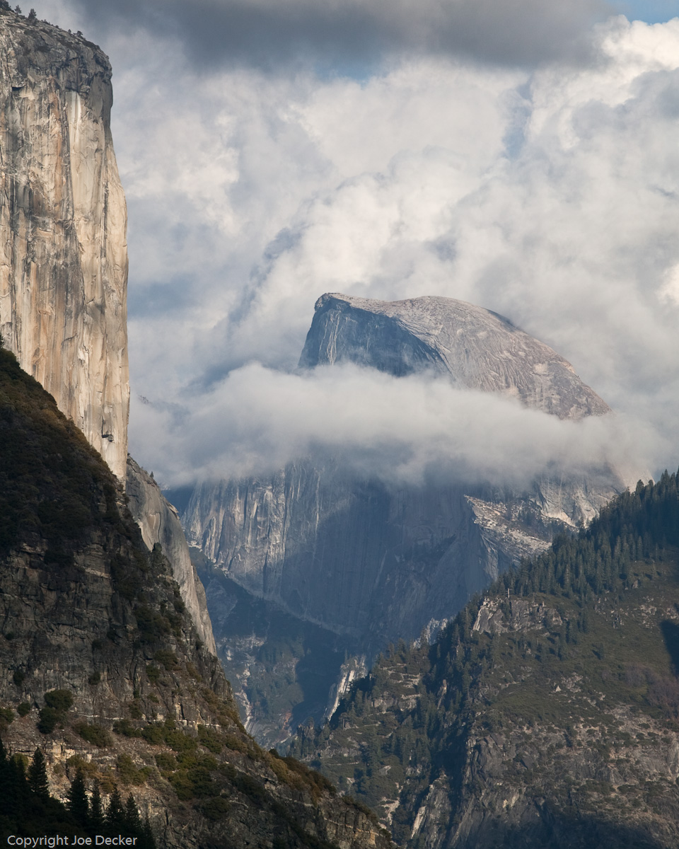
Different formats convey different moods. I often find square, or nearly square, compositions more peaceful or static. Layers is an excellent example of this. More rectangular compositions tend to feel dynamic and to convey movement in the long direction. Landscape images (that is, not images of the landscape, but images that are wider than they are tall) more naturally align with our human field of view, which is part of the reason that most cameras are set up to most easily take pictures in that orientation. Landscape images with about a 2:1 ratio often seem to evoke the use of that format in film, and have a “cinematic” character to them as a result.
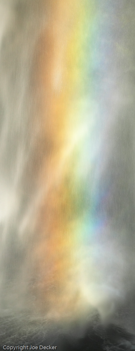
Panoramic images (that is, very skinny ones) tend to guide the eye along the long direction of the image. Rainbow Whirlwind works in part because the format of the image collaborates with the motion of the water to pull the eye from top to bottom in the image, finally leaving the eye to rest in the turbulent water at the bottom of the image.
Still, the elements within an image often determine the best format for that image. Most images have elements in them that are more effective, others that are less effective, hopefully few that are counterproductive. If we try and “fit the frame” of different formats around the most effective parts of an image, different formats will include more or less of the ineffective elements. Layers was made more effective by cropping away a particularly unattractive layer of cloud above the image, a crop I knew I would be making even when I shot the image.
So here’s an assignment for those of you up for one-take a look through images from your last shoot. Pick a couple of good images, and try and crop each one them to several different formats. For each one, try to create the best composition you can for that format. Don’t forget to work your borders as you work to find these crops. Do some of your images work better after cropping? If so, why? Drop me a note with what you find!
Next week we’ll continue looking at the interaction between the “frame” and the image by looking at image scale, and how it plays into composition.