The Tuesday Composition: Lighting and Composition

Traces of the Ancient Thule
Traces of the Ancient Thule, Danmark Ø, Scoresbysund, East Greenland. I wanted more texture in the foreground, front-lighting and soft light from clouds kept the rocks from being visible. I couldn't move to the side, because I wanted to include the bay behind. I couldn't come back because of the constraints of getting to this location in Greenland. My only option for introducing texture and depth into the foreground rocks was adding some fill flash, which I did with the help of a reflector.

If you like this article, you can now get the book! Joe has expanded the “Tuesday Composition” series into an inspiring new ebook on composition, especially for nature photography. Check it out: The Tuesday Composition.

A few years back, Frans Lanting said something in passing that’s really stuck with me, I presume it’s an old studio lighting maxim:

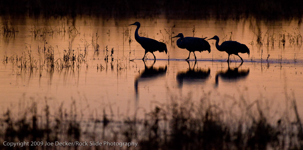
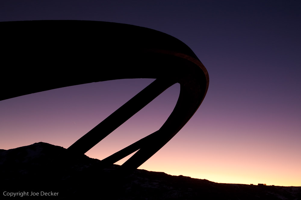
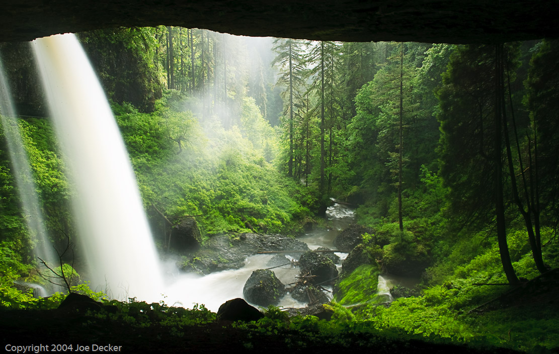
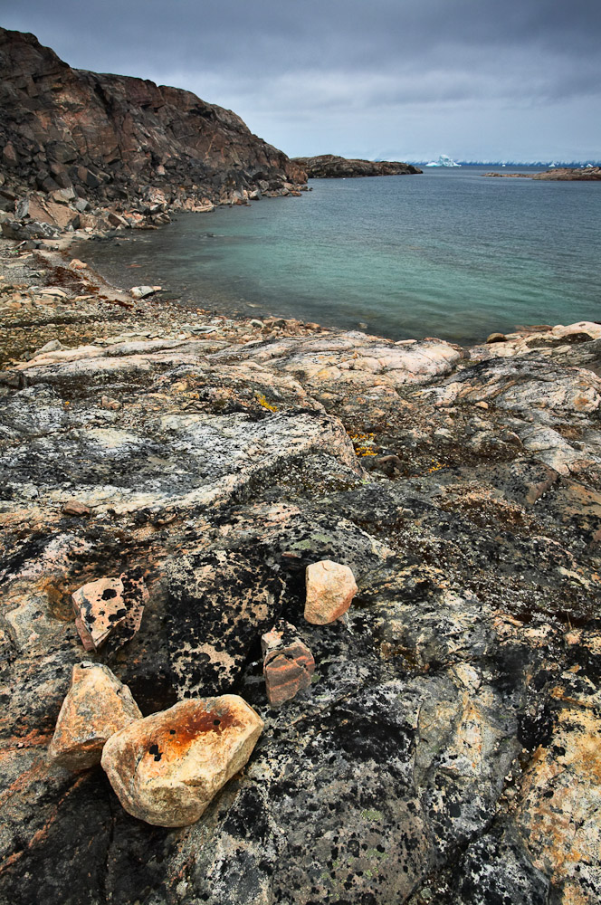
Front-lighting for color, side-lighting for texture, back-lighting for form.

This line is pretty much a recipe for how to light an object in the studio depending on what aspect of it you want to emphasize. Got a colorful subject? Start by photographing from the same direction as the light is coming from. Want texture?  Make sure the light is coming in from the side, that way it’ll be raking across the front of the subject you’re looking at and showing shadows on even the smallest bits of texture. And want to show the shape of something? Backlight it, and create a silhouette.

Obviously it’s simplistic (as any nine words of advice must be), but it’s not a bad place to start when thinking about lighting.

In addition to light direction, we also talk about the difference between soft (wide) light sources and hard (tiny) light sources. Hard lighting tends to pick up more texture by creating better-defined shadows than soft lighting.

What does all of this have to do with composition?

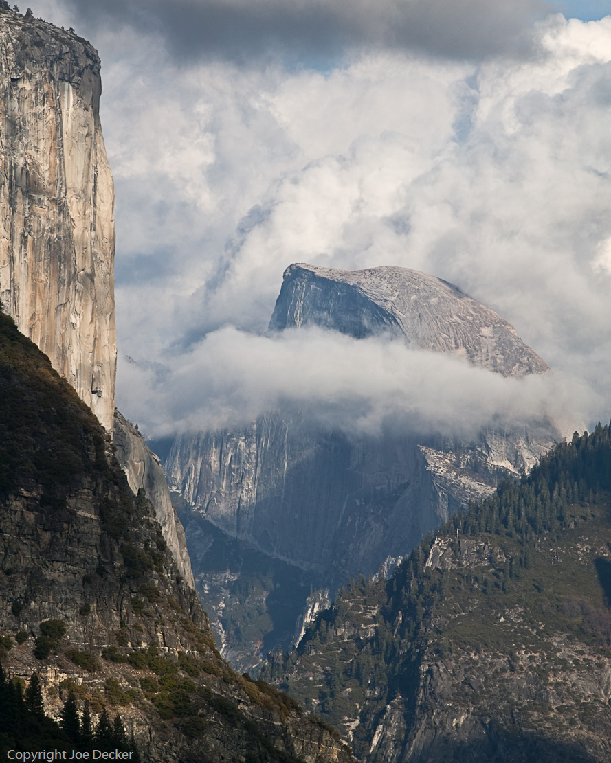
While we have a great deal of flexibility in lighting subjects in the studio, many of us who photograph nature, or events, or sports often have a little less room to organize our environment the way we’d like. We might have a couple different objects in our scene, and perhaps we’d like the form of one of them juxtaposed with the color of another and the texture of a third, and the light might be doing something else entirely. (more…)

Continue Reading

The Tuesday Composition: Working with Silhouettes

Crane Family Stroll, Sunrise, Bosque del Apache
Crane Family Stroll, Sunrise, Bosque del Apache. Generally, keeping silhouettes from merging makes a photograph easier to "read".

If you like this article, you can now get the book! Joe has expanded the “Tuesday Composition” series into an inspiring new ebook on composition, especially for nature photography. Check it out: The Tuesday Composition.

For the past week and a half, I’ve been shooting in New Mexico; and for the last few days I’ve been doing a lot of work at Bosque del Apache National Wildlife Reserve. Sunrises and sunsets are magical there, and often end up involving silhouettes, which got me thinking again about composing with silhouettes. I’ve touched on the subject of shadows and silhouettes before. But today I’ll go into more depth on the subject.

Silhouettes abstract objects into a two-dimensional shape, eliminating their color and texture. That’s a powerful tool for those moments where the shape of an object can communicate your intent effectively. But with that power comes a danger of accidentally removing some information you really need for the image to make sense. (more…)

Continue Reading

The Tuesday Composition: Live and In Color

Early light, Bodie
Early Light, Bodie. Purple and yellow form an effective color contrast here, incresing our sense of saturation in both colors. (Having them set against black also helps pump up the apparent saturation.)

If you like this article, you can now get the book! Joe has expanded the “Tuesday Composition” series into an inspiring new ebook on composition, especially for nature photography. Check it out: The Tuesday Composition.

Even though we’re twenty or so columns into this series, nearly everything I’ve said so far about composition applies equally to monochromatic and color images. Today I’m going to focus a on how color and color combinations play into compositions. We’ll revisit a few old topics, such as contrast, edges and balance, and we’ll talk about how color figures into them. I’ll also talk a little bit about color theory, without giving a full introduction to it.

Contrast is the first subject I’ll revisit. Just as tonal contrast can be created with lots of sharp transitions from dark to light, color contrast can be created with lots of sharp transitions from a color to the complement (opposite) of that color. I was taught color complements in grade school by looking at a color wheel: Yellow is opposite purple; red is opposite green; blue is opposite orange. But don’t think you need to use those precise combinations to get great color contrast, nearly-complementary color combinations, such as yellow and blue, often create very effective color contrasts as well (as in Aspens, Walker Creek, below). (more…)

Continue Reading

The Tuesday Composition: Composing Images with Water

Surf, Garrapata Beach
Surf, Garrapata Beach. Still images can't capture motion in water, but they can communicate the idea.

If you like this article, you can now get the book! Joe has expanded the “Tuesday Composition” series into an inspiring new ebook on composition, especially for nature photography. Check it out: The Tuesday Composition.

Like mist and fog, water is a subject that deserves it’s own consideration compositionally. With the exception of very still lakes and ponds, one of the things that makes water “look like water” to us is the way that it moves. We can’t present this movement in a still image to a viewer directly. Instead, we have to translate it into a still image by making an exposure; and we use a variety of controls such as shutter speed and composition to help communicate a sense of that motion.

When we want to capture a sense of movement in water there are several things to keep in mind. Shutter speed has a significant effect-a waterfall, cascade or even surf against a coastline will have a very soft, gentle feel if we use a long exposure. Faster exposures will stop individual droplets in air, creating a greater sense of energy.  Shutter speed isn’t the only thing to keep an eye on, though. The way we compose the path of water through a scene can also affect how viewers experience water moving through a scene. Where possible, try and make it easy for the viewer’s eye to trace along the lines of the water’s path. Your images will (all other things being equal) be more effective if the visual flow of the water isn’t interrupted by things that block the view of the water. Diagonals and  S-curves can also create an additional sense of motion. (more…)

Continue Reading

The Tuesday Composition: Communicating Immensity

Cerro Torre
Cerro Torre, Los Glaciares National Park, Argentina

If you like this article, you can now get the book! Joe has expanded the “Tuesday Composition” series into an inspiring new ebook on composition, especially for nature photography. Check it out: The Tuesday Composition.

One of the most common challenges in landscape photography communicating the scale of large objects. Photographs seem to resist conveying the sense of scale we often feel in a landscape. When we take the photograph, we have the opportunity to move around in the landscape, to hike a half-mile and notice that our view of the mountain hasn’t changed much. Our brains unconsciously integrate that information into our perceptions of the world around us. Viewers of our still photographs see things much differently.

Small prints and web images are particularly challenging. Our minds seem to resist  perceiving  a mountain that stretches a mile into the air within a photograph that fits inside a lunch box. Even large prints sometimes seem to lack any real ability to communicate the size of the landscape they portray.  As a result, rather than relying on making large prints, we have to understand how our brains perceive scale in still images, and take advantage of the cues our brains use in that process. (more…)

Continue Reading

The Tuesday Composition: Framed, Inside and Out

North Falls Canyon, Silver Falls State Park, Oregon

If you like this article, you can now get the book! Joe has expanded the “Tuesday Composition” series into an inspiring new ebook on composition, especially for nature photography. Check it out: The Tuesday Composition.

Many of the topics we’ve discussed so far talk about the relationship between two objects in an image, from their relative distance from the camera to whether one is left or right of the other to visual similarity between two objects. Many of the cues we use to communicate using photographs stem from these sorts of signs. Today I’ll talk about another example: what happens when one image frames another within a photograph. I’ll say that the enclosing object “frames” the enclosed object, but here I’m not referring to picture frames, I’m still talking about parts of the photographic image itself.

These frames tend to serve two ends. Visually, frames in general (and darker frames in particular) often guide the eye toward the center of an image much in the same way that edge-burning does. As a matter of meaning,   framing often provides context for the enclosed subject of the image. I think it’s likely that these two effects are related; our eyes are pulled to the center,   the enclosed object in such a photograph, and as a result that object becomes the primary subject of the image. The frame itself speaks second, not first. (more…)

Continue Reading

The Tuesday Composition: Telephoto Compression

Layers, Yosemite National Park, California
Layers, Yosemite National Park, California. A classic viewpoint, 300mm focal length. While we intellectually understand that the elements of this image are at quite different distances from the camera, telephoto compression seems to take away some of the cues our brain uses to perceive depth.

If you like this article, you can now get the book! Joe has expanded the “Tuesday Composition” series into an inspiring new ebook on composition, especially for nature photography. Check it out: The Tuesday Composition.

Just as I often turn to wide-angle lenses when I want to create images with a sense of depth and perspective, when I purposefully want to lose a sense of depth, when I want to compress elements of an image in order to abstract or combine them, then I’ll often look to the longer end of my over-abundant collection of lenses.

First, it’s worth acknowledging that, pedantically, telephoto lenses don’t change perspective (warning: PDF document).  Seen from the same point, two objects will change in size, but proportionally, when you change lenses. Of course, if you change your shooting position to compensate for the new focal length, that’s a different matter entirely. So I’ll avoid saying that telephoto lenses change the perspective in a scene.

But there is a real, identifiable “look” to images we extract out of a scene using a long telephoto lens. We often talk about telephoto images as looking “flat” or “compressed”, these images do not seem to trigger our visual system into perceiving an illusion of depth in the image the way that many wide-angle shots do. Where does that look come from? I believe it primarily comes from two factors. (more…)

Continue Reading

The Tuesday Composition: Both Near and Far

Bleached bush skeleton, Mono Lake, California
Bleached bush skeleton, Mono Lake, California. This image would have been more effective if I'd used a bit of flash to highlight the dead bush to emphasize that it's the subject of the image, I'll almost certainly dodge up (brighten) the bush in printing.

If you like this article, you can now get the book! Joe has expanded the “Tuesday Composition” series into an inspiring new ebook on composition, especially for nature photography. Check it out: The Tuesday Composition.

One of the more common idioms in landscape of photography is the near-far composition, a powerful technique for creating depth and relationships within a photograph.

In a near-far composition, a small foreground element is emphasized and placed in a background that establishes context for that element. For example, the dead bush in Bleached Bush Skeleton, the bush remains are the subject of the photograph. The lake, the tufa in the lake and the Sierra Nevada all tell us something about the location the bush remains are in.

Put another way, if you were to try and write a sentence describing what a near-far photograph is about, it would usually be something like, “This foreground (thing) is in the background (environment).”  The foreground object is the subject of the sentence, it is in general the more important of the two elements in a near-far image.

When I say that the foreground is emphasized, it’s important to be clear about how that’s done. For the foreground to be comparable in size to the background, it needs to be much closer to the lens than the background. While it might seem in theory that this could be accomplished with almost any sort of lens, the smaller depth-of-field of telephoto lenses often make it impossible to keep near and far objects both in focus. As a result, the most dramatic near-far compositions are usually made with wide-angle lenses. Hyperfocal focusing is often used to create the greatest depth-of-field. (more…)

Continue Reading

The Tuesday Composition: Scale

Tree Ballet and Pogonip, Mono Basin, Eastern Sierra, California.
Tree Ballet and Pogonip, Mono Basin, Eastern Sierra, California. At small image sizes, simple compositions are effective more often than complex ones.

If you like this article, you can now get the book! Joe has expanded the “Tuesday Composition” series into an inspiring new ebook on composition, especially for nature photography. Check it out: The Tuesday Composition.

One of the axes on which I measure compositions is their degree of complexity–not just the complexity of the image itself but the complexity of the composition.

On one end, we have very simple, spare compositions that embody perhaps a couple of the compositional principles we’ve discussed.  On the other end of the spectrum, we have compositions that orchestrate a far greater number of these principles on a smaller scale.  Today I’d like to touch on some of the ways these differences affect the effectiveness of your images.

I’ll start by saying that my images tend very much towards the leaner side of this spectrum. One of my first teachers was the late Galen Rowell, who shared this affinity for simplicity. Galen had come to nature photography from mountain-climbing, and as a result had decided to work entirely with lightweight 35mm-format cameras in his own work. Both the smaller format of the slides themselves (compared with medium and large-format cameras) and the presentation of these images in smaller forms (at first, often magazines, I suspect) likely pushed him in the direction of simplicity–if the individual parts of a composition don’t render large enough to move your eye, they’re not going to have much of an effect on your image. While Galen’s images are fantastic even at large scale, their ability to feel compositionally strong even at smaller scales reflects the simplicity and directness of his compositions. (more…)

Continue Reading

The Tuesday Composition: Compositional Shapes

Layers, Yosemite NP, California

If you like this article, you can now get the book! Joe has expanded the “Tuesday Composition” series into an inspiring new ebook on composition, especially for nature photography. Check it out: The Tuesday Composition.

In previous posts in this series, I’ve talked a lot about how the elements within an image play into how we view it. How lines guide our eye through images, how highlights in the image attract our eyes, how the direction things are moving, or looking into, play into composition. But for much of this conversation we’ve ignored one of the elephants in the compositional room–the shape of the image as a whole. Is it square or rectangular, landscape or portrait, thick or thin? For the rest of this article I’ll call this the “format” of the picture. (I apologize in advance for any confusion with other senses of the word format, e.g., medium-format.)

Often, the choice of what format to compose our image within isn’t made consciously. Instead, often we (and I include myself in this) are guided by what camera we use, and pragmatic considerations about presentation and framing. Most of my images have a 3:2 aspect ratio. It will come as no surprise that this is the same format as the sensor in my digital cameras, as well as the format of the openings in the standard window mats I buy in quantity. This isn’t entirely bad, it does help create a certain consistency of “look” to shows of my work. Still, it’s not a choice that should usually be made unconsciously.  Some images, some ideas just work better in different formats than others, and with the plethora of pixels that come out of modern digital SLRs, often little is lost when we crop an image to improve it. (more…)

Continue Reading
Close Menu