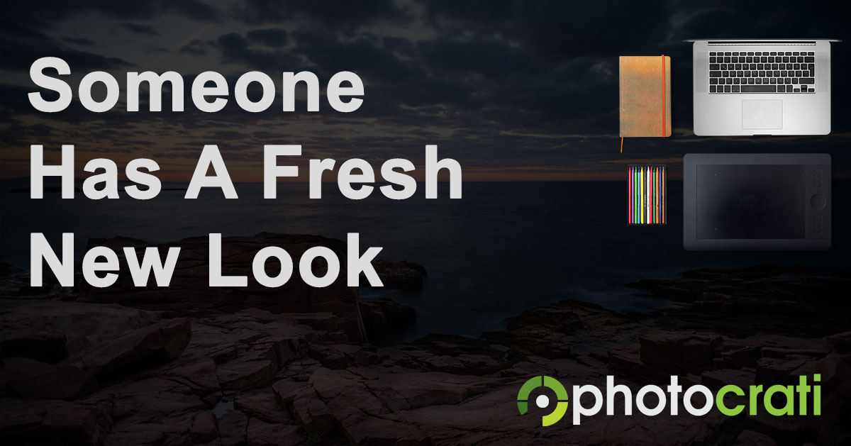
The Photocrati website went under the knife and came out with a brand new look and logo.
Why? NextGEN Gallery and the Photocrati Theme are getting closer to a tight integration. So we wanted the two products to have consistency. That way when customers are going between the documentation for either product, it’s more obvious that it’s the same company.
That, and we also wanted a prettier logo.
We went with 99Designs for crowdsourced logo ideas. We then came up with our favorites and internally (and partially externally) voted for the ones we want to narrow it down to.
Once we picked the winner, we worked with the designer to make some final adjustments to the logo.

The icon is the most important part of the logo. Because that is consistent between the 2 products.
In addition, the icon can be used without text, and also says some things about the company.
Step back from the icon a bit and you will notice that it is actually the letter p. Cool, right?
But on top of that, it’s also a play on the standard aperture blade logo that many photographers use. Except it’s broken up, with multiple shades of green.
So with that all, said, we hope you enjoy the new logo as much as we do.
Thanks for taking the time to read this!
