If you like this article, you can now get the book! Joe has expanded the “Tuesday Composition” series into an inspiring new ebook on composition, especially for nature photography. Check it out: The Tuesday Composition.
Last week we discussed areas of high contrast, this week we’re going to turn around and say a few words about low contrast areas and how they contribute in a composition.
At least one of these effects shouldn’t be too much of a surprise if you read last week’s column. If our eye tends to gravitate over time towards the high-contrast parts of a composition, then it more or less equally gravitates away from the low-contrast areas of the image. I won’t dwell on this aspect of it, if you want a nice, simple example start with the tree at the head of last week’s column and notice that the valley walls don’t pull your eye the way the tree does.
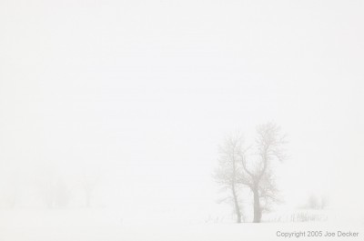
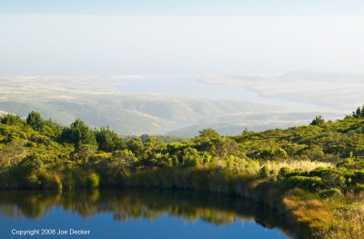
But as much as that’s true in last week’s tree, it is even more true for Tree Ballet. Save for three small areas of the image (the bare trees and a couple patches of dead grasses) Tree Ballet has no real detail or contrast whatsoever. Whereas the small amount of detail in the valley walls in Morning by the Merced will occasionally pull your eye in to look at what detail is present, the complete lack of sharp detail in Tree Ballet does not. We say that most of this image consists of “negative space”. “Negative space” is the art term for space around the subject of an image. The large area of this image devoted to negative space is important to this image, it emphasizes the cold, isolating fog.

Whereas high-contrast images tend to make an image feel busy, energetic, vibrant, chaotic; low-contrast images seem to convey quiet, space, vastness and/or isolation, many of those ideas are easily seen here in Tree Ballet. In Pond and Drake’s Estero, the low-contrast helps contribute to a sense of distance and therefore scale.
I’ve asked (and will continue to ask) for brave souls willing to risk having their image discussed on the site here, and one such brave soul sent me in this cool image from a graveyard entitled Dead Early 2, which really demonstrates some points I’d made in my previous article on silhouettes. The headstones themselves are the primary subjects, and our eye is first brought to them by the combination of them being right in the center of the brightest highlight.
From there, the use of silhouettes here is very effective at focusing our attention on the shape of the crosses and such, rather than their color or texture, similarly for the silhouettes of the tree (and the church-like arches that their lower branches create). The shadows of the gravestones create lines from the gravestones to the bottom of the image, sending our eyes moving back and forth along those lines and creating a sense of movement, energy and drama.
There’s a lot more to say about Dead Early 2. In terms of suggestions for improvement, I suggested a couple things I might have tried (it seems a tiny bit off-level, cropped a bit off the right, and I might have experimented with compositional variations on this image (for example, maybe trying to go a little lower and wider-angle). But it’s more important to keep those comments in perspective, Mark found a composition here that demonstrates nearly every principle we’ve discussed, and created what I think is an interesting and very effective image as a result. Good job, Mark!
Next Tuesday: Compositional distractions, how to avoid them, and why.