If you like this article, you can now get the book! Joe has expanded the “Tuesday Composition” series into an inspiring new ebook on composition, especially for nature photography. Check it out: The Tuesday Composition.
Last week we talked about working the edges of your photographs. This week, I thought we’d start taking about where we place objects in an image; I like Geir Jordahl’s metaphor of choreography. By moving around, by pointing the camera in different directions, by choosing a framing and focal length and orientation of our shot, we’re including and excluding objects from our image, changing their size and shape and moving them around within our image. While we do not have (outside of Photoshop) unlimited flexibility to rearrange our images this way, we do have quite a number of controls over where we place in our images. So, where should we put them? Where will they look best?
This is the central question of composition, and of course there aren’t any perfect single answers. And yet, one of the more consistent guidelines that seems to help beginning photographers is to stop putting things smack-dab in the middle of your pictures. (Next week we’ll talk about some exceptions.)
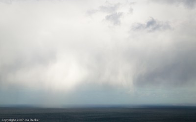
The most common example of this mistake is the clich travel photograph of the ocean: big blue sky, but blue ocean, horizon set precisely half-way down the image. Sometimes these photographs fail because neither the sky nor the ocean is that interesting. But more often the photographer did see something interesting, say, the deep azure of a tropical lagoon, and the photographer failed to work with it effectively. Drawing attention to the interesting part of the composition can be as easy as pointing your camera downward, including more of the more-interesting water, and less of the less-interesting sky. Often, it’s just that simple: include more of the good stuff.
We can push this last idea further, if the sky is completely uninteresting, how about getting rid of it entirely? Sometimes that works well. But even a small section of a boring sky can serve to add context to an image and help make sense of it. A lot of photographs are like that, with a primary subject, and stuff around the subject that provides context for it, contrasts with it, or in some other way complements it.
This applies to centering things horizontally as well as vertically.
The general success of off-center compositions isn’t just about emphasis, either. Centered compositions (and we’ll talk about this more next week) often feel static, unnatural (pre-arranged) and/or formal. While any of those characteristics can be a positive in any particular image, we tend to be attracted more to dynamic images in general.

If the subject shouldn’t be centered, where should it be? Some textbooks tell you to follow the “rule of thirds“, which suggests putting a subject one-third of the way from one edge of an image the opposite edge. Classical literature suggests using the golden ratio, which would have you place things about 38% of the way from one edge to another.
I say: Ignore the numbers.
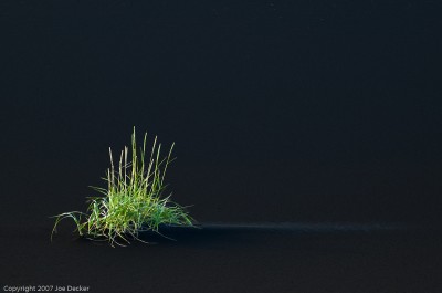
Instead, recognize that off-center placements tend to be more dynamic and to provide emphasis. At the same time, sometimes bringing an object very close to an edge starts feeling wrong too. The shape of the objects or areas involved may play into it as well. Look at Grasses and Volcanic Alluvium. There’s no single “point” to the main bunch of grasses.
With these ideas in mind, look with your eyes through the viewfinder (you have your camera on a tripod, yeah?). Take some time to look and see what feels right. Your intuition, once you’ve been doing this for a while, will be a much better guide to composition than any equation will ever be.