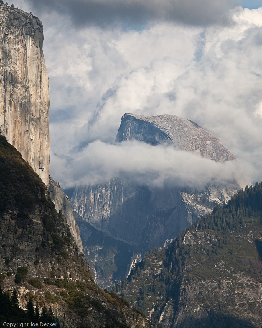
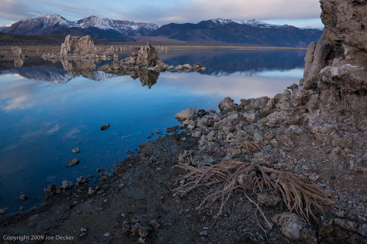
Better Habits for Better Photography

Kali Climber
Kali Climber, Eastern Sierra, California. Developed habits allowed me to get this shot off quickly after diving for the dirt to create this unusual composition.

Today over on twitter someone reminded me of something Galen Rowell taught me many years ago, and I realized the subject required more than 140 characters to explain. The basic idea sounds simple to start with: Essentially, after you shoot, the idea is to leave the camera back at some “default” set of settings. In my case, that’s typically auto-focus, ISO 100, aperture-priority, f/16, RAW, mirror lockup enabled. (Except when it’s something else.)

At first glance that’s sensible enough on the face of it. Those are some pretty reasonable “will work with a lot of landscape images” sorts of settings, and having relatively reasonable settings in the camera will reduce the chance that I forget to change some setting (ISO 12800, or f/32) that I won’t want on the next shot.

But the benefits of this habit go deeper than that.

Galen took this idea to the next level, in what he described as expert systems for photography. If I know (because I have great habits) that my settings are what I’ve described above, I can respond more quickly. Imagine that I’m walking down the trail with my camera backpack, and I turn a corner, and there it is. “Celene Dion riding a unicorn through a field of baby animals under a big blue sky“, (warning: link is a silly video digression) and I’ve only got three seconds to get the shot. (more…)

Continue Reading

Traveling with Equipment

One requirement of being a corporate photographer is travel. Fortunately most of my travel is fairly local, or at least what I consider local, Philadelphia to Washington DC and on occasion, New York. I tend to be in DC a couple times a month, sometimes a couple times a week. Most of my trips are by train so I try to travel light, and by light I mean two Nikon bodies, four lenses, three speed lights, Pocket Wizards and batteries, so not really light. I needed to find an easier way to carry my gear. (more…)

Continue Reading

The Tuesday Composition: Telephoto Compression

Layers, Yosemite National Park, California
Layers, Yosemite National Park, California. A classic viewpoint, 300mm focal length. While we intellectually understand that the elements of this image are at quite different distances from the camera, telephoto compression seems to take away some of the cues our brain uses to perceive depth.

If you like this article, you can now get the book! Joe has expanded the “Tuesday Composition” series into an inspiring new ebook on composition, especially for nature photography. Check it out: The Tuesday Composition.

Just as I often turn to wide-angle lenses when I want to create images with a sense of depth and perspective, when I purposefully want to lose a sense of depth, when I want to compress elements of an image in order to abstract or combine them, then I’ll often look to the longer end of my over-abundant collection of lenses.

First, it’s worth acknowledging that, pedantically, telephoto lenses don’t change perspective (warning: PDF document).  Seen from the same point, two objects will change in size, but proportionally, when you change lenses. Of course, if you change your shooting position to compensate for the new focal length, that’s a different matter entirely. So I’ll avoid saying that telephoto lenses change the perspective in a scene.

But there is a real, identifiable “look” to images we extract out of a scene using a long telephoto lens. We often talk about telephoto images as looking “flat” or “compressed”, these images do not seem to trigger our visual system into perceiving an illusion of depth in the image the way that many wide-angle shots do. Where does that look come from? I believe it primarily comes from two factors. (more…)

Continue Reading

The Tuesday Composition: Both Near and Far

Bleached bush skeleton, Mono Lake, California
Bleached bush skeleton, Mono Lake, California. This image would have been more effective if I'd used a bit of flash to highlight the dead bush to emphasize that it's the subject of the image, I'll almost certainly dodge up (brighten) the bush in printing.

If you like this article, you can now get the book! Joe has expanded the “Tuesday Composition” series into an inspiring new ebook on composition, especially for nature photography. Check it out: The Tuesday Composition.

One of the more common idioms in landscape of photography is the near-far composition, a powerful technique for creating depth and relationships within a photograph.

In a near-far composition, a small foreground element is emphasized and placed in a background that establishes context for that element. For example, the dead bush in Bleached Bush Skeleton, the bush remains are the subject of the photograph. The lake, the tufa in the lake and the Sierra Nevada all tell us something about the location the bush remains are in.

Put another way, if you were to try and write a sentence describing what a near-far photograph is about, it would usually be something like, “This foreground (thing) is in the background (environment).”  The foreground object is the subject of the sentence, it is in general the more important of the two elements in a near-far image.

When I say that the foreground is emphasized, it’s important to be clear about how that’s done. For the foreground to be comparable in size to the background, it needs to be much closer to the lens than the background. While it might seem in theory that this could be accomplished with almost any sort of lens, the smaller depth-of-field of telephoto lenses often make it impossible to keep near and far objects both in focus. As a result, the most dramatic near-far compositions are usually made with wide-angle lenses. Hyperfocal focusing is often used to create the greatest depth-of-field. (more…)

Continue Reading

Photographing Bodie

Bodie State Historic Park, California

East of California’s Sierra Nevada, north of Mono Lake lies the abandoned mining town of Bodie, California. Bodie boomed after the discovery of gold ore in the 1870s, by 1920 the town was in a steep and never-reversed decline. In 1962 the area was designated a California state historic park and remains that today. Several aspects make Bodie a particularly interesting target for photographers intrigued by the Gold Rush era ghost towns.

First and foremost Bodie is maintained in a state of arrested decay, that is, the park attempts to maintain Bodie the way it was in 1962, repairing what’s necessary to maintain that state but no more so. Interiors of many of the town’s buildings buildings still contain original furniture and such. And because Bodie hasn’t been commercially developed, it’s easy to find many places to take unique, “timeless” photographs without anachronisms. (more…)

Continue Reading

What equipment do I need to be a wedding photographer?


I was thinking today about what I would have liked to known when I was first starting out as a wedding photographer in Tampa and realized that, despite the wealth of information available to the newby, I don’t recall ever seeing a detailed breakdown of the equipment a typical wedding photographer carries to a shoot. So, with that in mind, here’s a breakdown of the equipment in my bag with comments about how I use it. This is, by no means, a definitive list. It’s just what I am carrying right now and could change at any time.

(2) Canon 40D – The Canon 40D may not be the best that Canon has to offer but it will certainly get the job done. Don’t get too caught up in the rush to buy the newest and most advanced camera available. The cheapest DSLR on the market is still light-years more advanced than every camera that came before it. Personally, I prefer two identical camera bodies. It’s a comfort to me that I can grab either camera and get the same results.

(4) Camera Batteries – One battery in each camera body and two backups. I don’t use a battery grip with my camera. I’ll admit I envy the convenience of the added controls so that you can hold the camera in portrait mode the same way you do in landscape but I’m put off by the extra bulk and weight. If I found myself frequently changing batteries during a shoot I would probably get a grip, but I rarely have to use my backup batteries.

(1) Black Rapid Strap (1) standard strapI’ve written about this before. When I feel it necessary to carry both cameras, I have a second strap around my neck. Both my camera’s have Manfrotto tripod mounts on the bottom and I attach the straps there with speed clips. Typically, I will wear both straps during the ceremony and sometimes during the reception. I just attach the camera’s as needed.

Lenses:

st. petersburg wedding photographer 5
Sigma 18-50, f2.8 – This is my main lens and is on my camera 90% 0f the time.

(more…)

Continue Reading

The Tuesday Composition: Scale

Tree Ballet and Pogonip, Mono Basin, Eastern Sierra, California.
Tree Ballet and Pogonip, Mono Basin, Eastern Sierra, California. At small image sizes, simple compositions are effective more often than complex ones.

If you like this article, you can now get the book! Joe has expanded the “Tuesday Composition” series into an inspiring new ebook on composition, especially for nature photography. Check it out: The Tuesday Composition.

One of the axes on which I measure compositions is their degree of complexity–not just the complexity of the image itself but the complexity of the composition.

On one end, we have very simple, spare compositions that embody perhaps a couple of the compositional principles we’ve discussed.  On the other end of the spectrum, we have compositions that orchestrate a far greater number of these principles on a smaller scale.  Today I’d like to touch on some of the ways these differences affect the effectiveness of your images.

I’ll start by saying that my images tend very much towards the leaner side of this spectrum. One of my first teachers was the late Galen Rowell, who shared this affinity for simplicity. Galen had come to nature photography from mountain-climbing, and as a result had decided to work entirely with lightweight 35mm-format cameras in his own work. Both the smaller format of the slides themselves (compared with medium and large-format cameras) and the presentation of these images in smaller forms (at first, often magazines, I suspect) likely pushed him in the direction of simplicity–if the individual parts of a composition don’t render large enough to move your eye, they’re not going to have much of an effect on your image. While Galen’s images are fantastic even at large scale, their ability to feel compositionally strong even at smaller scales reflects the simplicity and directness of his compositions. (more…)

Continue Reading

The Tuesday Composition: Compositional Shapes

Layers, Yosemite NP, California

If you like this article, you can now get the book! Joe has expanded the “Tuesday Composition” series into an inspiring new ebook on composition, especially for nature photography. Check it out: The Tuesday Composition.

In previous posts in this series, I’ve talked a lot about how the elements within an image play into how we view it. How lines guide our eye through images, how highlights in the image attract our eyes, how the direction things are moving, or looking into, play into composition. But for much of this conversation we’ve ignored one of the elephants in the compositional room–the shape of the image as a whole. Is it square or rectangular, landscape or portrait, thick or thin? For the rest of this article I’ll call this the “format” of the picture. (I apologize in advance for any confusion with other senses of the word format, e.g., medium-format.)

Often, the choice of what format to compose our image within isn’t made consciously. Instead, often we (and I include myself in this) are guided by what camera we use, and pragmatic considerations about presentation and framing. Most of my images have a 3:2 aspect ratio. It will come as no surprise that this is the same format as the sensor in my digital cameras, as well as the format of the openings in the standard window mats I buy in quantity. This isn’t entirely bad, it does help create a certain consistency of “look” to shows of my work. Still, it’s not a choice that should usually be made unconsciously.  Some images, some ideas just work better in different formats than others, and with the plethora of pixels that come out of modern digital SLRs, often little is lost when we crop an image to improve it. (more…)

Continue Reading

Wedding Photography and Using Your Surroundings

One of the things that quickly distinguishes a professional photographer from an amateur is the ability to select a good location for a portrait (also, professional photographers have an air of mystery and suave intrigue about them, like James Bond).   I see this every weekend when I’m shooting weddings (I’m a wedding photographer in Tampa, FL). People have a  preconceived idea about how a photograph should look. They’ve seen wedding photographs before and they’ve seen tons of pictures taken at the portrait studio in the mall (or at school) and so, subconsciously,   they believe that’s what a good picture looks like. (Not that they aren’t good. Don’t write me a nasty email, Mr. School Photographer. I shoot them too…) A good example of this at a wedding is that most people expect me to take a group  and family portraits on the altar–and many times I don’t.

If you look at any good portrait photographer who works primarily on location you’ll see a common thread. They have a knack for looking at the surroundings and figuring out the best way to place their subjects. Being able to manipulate your surroundings  to your advantage  will help you in every type of photography that you do. In wedding photography,  it can be the difference between a good picture and a great one.

With that in mind, I thought I might post some pictures from a recent wedding and talk about how I manipulated  my surroundings to create, what I think, are better pictures. I’m just going to concentrate on posed shots this time around and maybe later I’ll do a post on candids.

This first picture was taken just before the bride  left the dressing room to go and start the ceremony. We were already running 10 minutes late  and the wedding planner was dragging her out the door when I stopped her.

“Can I just have 30 seconds?” I quickly closed the door and opened the blinds.   Then I said, “somebody turn out the lights.”   This shot is nothing but window light and a gray wall.

Window light and a gray wall

(more…)

Continue Reading

The Tuesday Composition: Repetition

Salt Polygons at Sunrise, Death Valley

If you like this article, you can now get the book! Joe has expanded the “Tuesday Composition” series into an inspiring new ebook on composition, especially for nature photography. Check it out: The Tuesday Composition.

A while back we talked about visual echoes–and we primarily focused on repetitions of two similar or contrasting objects. Today I’m going to revisit that topic with a greater emphasis on repetition generally, whether two, eleven or a million similar image elements.  If you didn’t get a chance to read the echoes post, I suggest going back and and reading it now, many of the ideas in today’s post will relate to and reflect on the ideas I presented there.

Repetition is a powerful and amazingly versatile tool.

One of my favorite uses of repetition in composition is in simplifying an image. In general, images with many kinds of disparate elements can be harder for the viewer to make sense of–put enough elements together and you take away an easy sense of what elements of the image are important, dominant.

Repeating patterns in an image can help organize all of those elements into a pattern that’s easier for the viewer to understand. Salt Polygons at Sunrise has hundreds of elements, but our eye quickly integrates the underlying pattern of the salt polygons and makes sense of what’s going on in the image. A random collection of that many disparate elements in an image would feel much more chaotic. (Of course, that might be what you want, but more often, my own work tends towards less chaotic.) (more…)

Continue Reading
Close Menu