Back in March I posted an article entitled, Working for the Man about what life is like as a corporate shooter. Well I thought it was time for an update. We just survived a corporate-wide rumor that the Hatchet Man cometh, but as with most corporate chatter it was nothing but a rumor. So I live to shoot another day, (more…)
If you like this article, you can now get the book! Joe has expanded the “Tuesday Composition” series into an inspiring new ebook on composition, especially for nature photography. Check it out: The Tuesday Composition.
As I’ve said before (and will keep saying), these photographic “rules” we talk about are more like dozens of tools in a large toolbox, and the vast majority of your images will only use a small subset of those tools. In fact, often there are very good reasons to do precisely the opposite of whatever one of these guidelines might seem to suggest, sometimes the rules themselves are contradictory. Today’s column is a case in point. Last week I explored a number of reasons you’d usually be better off not centering things vertically or horizontally in your images. This week, I’m going to mention some exceptions, but those exceptions are no more hard-and-fast as the original “rule” was. As such, I hope that you’ll not only get some ideas about why images might work well centered, but also that you’ll get a little better idea of what I mean by the “toolbox” metaphor. (more…)
Being a photographer is a great way to make a living. Sure it’s challenging, but anything worth doing is. Sure it takes talent and hard work, but anything worth doing does. But c’mon, I’m not saving the world here. (more…)
Saguaro Silhouette. Nice idea, but this particular shot wasn't a "keeper" because of wind movement. Pity!
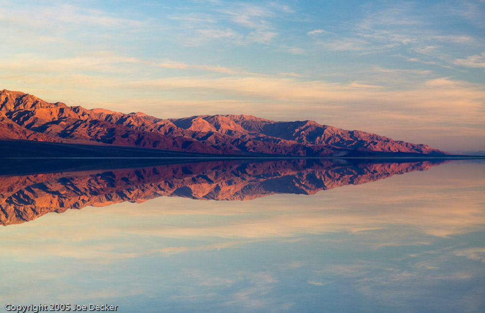
(In my three-part introduction to photographing Death Valley (part 2, part 3), I noted that I wanted to spend some time talking about techniques for photographing cactus, my apologies for the delay in getting that finished for you. I hope it was worth the wait!)
Cacti astonish me. The desert air can be dessicating, a sponge pulling every drop of water out of everything around it, and yet many of these plants have evolved to survive and even thrive in these harsh environments.
For the photographer, cacti offer interesting forms, patterns and texture from their spines, and color from the occasional desert bloom. (more…)
A while ago I wrote about the NYPD being re-informed of our rights to take pictures of, well, whatever we want. It seems Homeland Security Secretary Janet Napolitano didn't get…
I think now, more than ever, it’s hard to tell what makes a “good picture.”
Photography, like all art, is subjective. Beauty is in the eye of the beholder, etc, etc. And with Photoshop becoming such an integral part of the work process, it’s getting to the point where the old “rules” for good photography are being tossed out the window. I think that’s just fine, and I’ll tell you why. (more…)
Peter Burian tests five lenses with great light gathering ability: the Canon EF 70-200mm f/4L IS USM, Tamron AF 70-200mm f/2.8 Di LD (IF) Macro, Tokina AF 50-135mm f/2.8 AT-X Pro DX, Nikon 17-55mm f/2.8G ED-IF AF-S DX and the Sigma AF 30mm f/1.4 EX HSM DC
Because most digital SLR camera owners demand compact, lightweight lenses, the vast majority of zooms feature a small maximum aperture. A typical kit lens is designated as f/3.5-5.6 indicating that the maximum aperture is quite small at the short end and becomes very small at longer focal lengths. In practical terms, that translates to moderate light gathering ability. The larger the numeral the smaller the opening in the lens and the less light that will reach the camera’s digital sensor.
A wide aperture lens is ideal for fast shutter speeds in low light conditions when you cannot use flash or a tripod. Shooting at f/2.8 allowed me to get many sharp photos at 1/125 sec. during a stage performance, using ISO 1000. With a more typical (smaller) aperture, much higher ISO levels would have been required for the same shutter speed and the images would have been seriously degraded by digital noise. (Nikon 17-55mm at f/2.8.) (c) 2009 Peter K. Burian
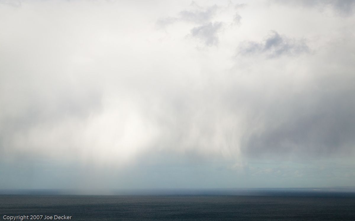
Virga over the Straits of Magellan. The sky was more interesting than the water, so I used a lot more sky than water. Sometimes it's that simple.
If you like this article, you can now get the book! Joe has expanded the “Tuesday Composition” series into an inspiring new ebook on composition, especially for nature photography. Check it out: The Tuesday Composition.
Last week we talked about working the edges of your photographs. This week, I thought we’d start taking about where we place objects in an image; I like Geir Jordahl’s metaphor of choreography. By moving around, by pointing the camera in different directions, by choosing a framing and focal length and orientation of our shot, we’re including and excluding objects from our image, changing their size and shape and moving them around within our image. While we do not have (outside of Photoshop) unlimited flexibility to rearrange our images this way, we do have quite a number of controls over where we place in our images. So, where should we put them? Where will they look best? (more…)
The background color of your site is important. Neutral colors are usually best, which leaves white, black, and shades of grey. Because colors tend to appear more saturated and lively against a dark background than a lighter one, I usually recommend darker greys (but not black) for color photographers, on the other hand, I think white or light grey backgrounds look great with a lot of monochromatic work. Spend a little time experimenting with your own images and different background tones to see just how big a difference it makes. (more…)
A navigation bar is perhaps the most important single element of your website.
Last week I covered some of the basic strategic questions you need to answer for yourself before putting together a web site. This week, I’ll talk about making your web site usable. If you have a large web site, it’s very likely that most folks who come to it will never see more than a couple of pages. It’s essential that your customers find the information they need.
To start, take out a piece of paper and jot down a list of what information you’d like to include on your site. Minimally, you need some of your images, and contact information, but depending on your business and how you hope to use your web site as part of your business (as we described last week), you may want to include: news, reviews, perhaps a blog or links to other social networking sites, and/or a biography that explains who you are, what you do and why. Don’t include an item on this list until you have a clear understanding of how it fits into your business. For example: “If a customer wants to place an order, they’ll need to contact me, so I’ll give them contact information.” (more…)